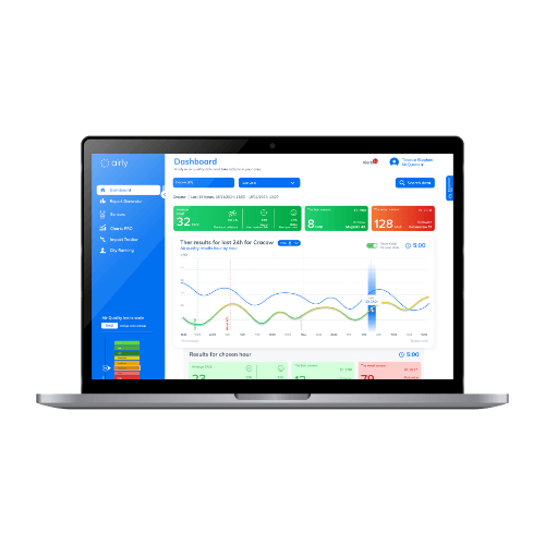
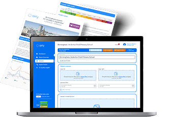
Log in to the Airly Data Platform
 Airly Map
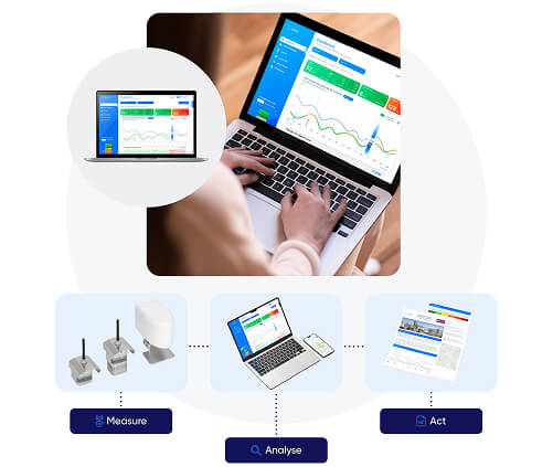
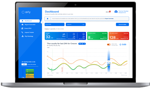
Built for insight, designed for action
Built for insight, designed for action
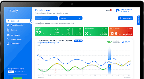
Airly Data Platform turns complex air quality data into clear answers. With a multifunctional dashboard and colour-coded graphs, you can analyse trends, compare areas, and create reports with just a few clicks.
Airly Data Platform combines live data from your Airly sensor network with public monitoring stations, giving you a full picture of air quality across your region and the tools to interpret it.
"It is a promising next step for us today to be able to launch the Air Pollution Sensors project with Airly as this will help us create further awareness across our communities of how the air pollution situation is progressing. Now it is time for us all to think about changes we can make to create a difference, as individuals and as organisations."
Councillor Waseem Zaffar MBEBirmingham City, Cabinet Member for Transport and Environment Council, Birmingham City Council